

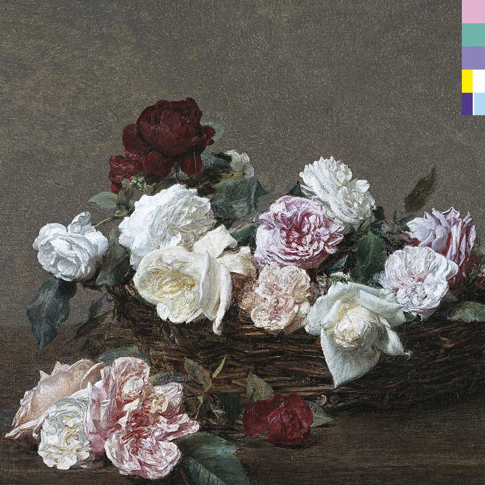
There's a particular kind of magic in an album sleeve that refuses to tell you what it is. No band name. No title. Just a basket of roses, lush, romantic, unmistakably old, and a thin strip of coloured squares running down the edge that most people, in 1983, wouldn't have known how to read. For an object designed to sell a record, it's an almost perverse decision. It's also, to my eye as a designer, one of the most quietly brilliant pieces of graphic design the twentieth century produced.
If you've seen the reel we posted this week, you'll know the cover I mean. Let's pull it apart properly.


The painting nobody was supposed to lend.
The image on the front is A Basket of Roses, an oil still life by the French realist Henri Fantin-Latour, painted around 1890. Fantin-Latour spent much of his career on flowers, and he was extraordinary at them, the kind of painter who gave every petal its own shadow. The original hangs in the National Gallery in London, which is worth flagging because the artist being French sends a lot of people looking in the wrong country.
The way it ended up on the sleeve is one of the great Factory anecdotes. Saville had gone to the National Gallery hunting for a Renaissance portrait of a "dark prince", something to tie literally into the Machiavellian ring of the title, but found nothing that worked. Giving up for the day, he bought a stack of postcards from the gift shop. His girlfriend, flicking through them, noticed he kept coming back to the Fantin-Latour and asked, half-teasing, whether he meant to use it for a cover. He decided, more or less on the spot, that he did.
Getting permission was another matter, the gallery first refused the label access. What happened next is pure Tony Wilson, the head of Factory. He rang the director and asked who actually owned the painting. It belongs to the people of Britain, came the answer. "I believe the people want it," said Wilson. "If you put it like that, Mr Wilson, I'm sure we can make an exception in this case."
Why roses, of all things.
Saville has always been clear that he wasn't trying to illustrate the music, a stance I find refreshing, and one that runs through all his best work. The romance was the point, precisely because it curdles against the title. The flowers, he said, suggested the seductive means by which power, corruption and lies infiltrate our lives. Beauty as a delivery mechanism for something less innocent. Once you've read the title, you can't un-see it in the bloom.
Now, the code.
Here's the part that makes the sleeve more than a pretty appropriation. Down the side of that lavish, nineteenth-century painting runs a strip of coloured blocks, a cipher, set in stark contrast to everything soft and romantic beside it.
Saville invented an alphabet where every letter is a colour. The logic came from an unlikely place, early computing. "The colour alphabet came from the fact that I understood the floppy disk contained coded information, and I wanted to impart the title in a coded form," Saville later explained. "Therefore, I converted the alphabet into a code using colours." He was fascinated, around this time, by what history might look like once it was pulled up on a computer screen, the collision of the classical and the digital, hieroglyphics of technology laid over an old master.
The decoder lived on the back, as a wheel: 26 segments running the alphabet clockwise from a green block at the top, the numbers 1–9 doubling up on the first nine letters. Fans were left to work it out themselves, and did. So what does the front actually say? Not the band. Not the title. Read the blocks down the edge and they spell FACT 75, the Factory catalogue number, hidden in plain sight. The band name and album title were tucked away on the inner sleeve.
He liked the system enough to reuse it, the same code turns up on the "Blue Monday" and "Confusion" singles, and on Section 25's From the Hip. And the fans, being fans, out-read him: they even spotted a spelling mistake in it.
Who was Peter Saville?
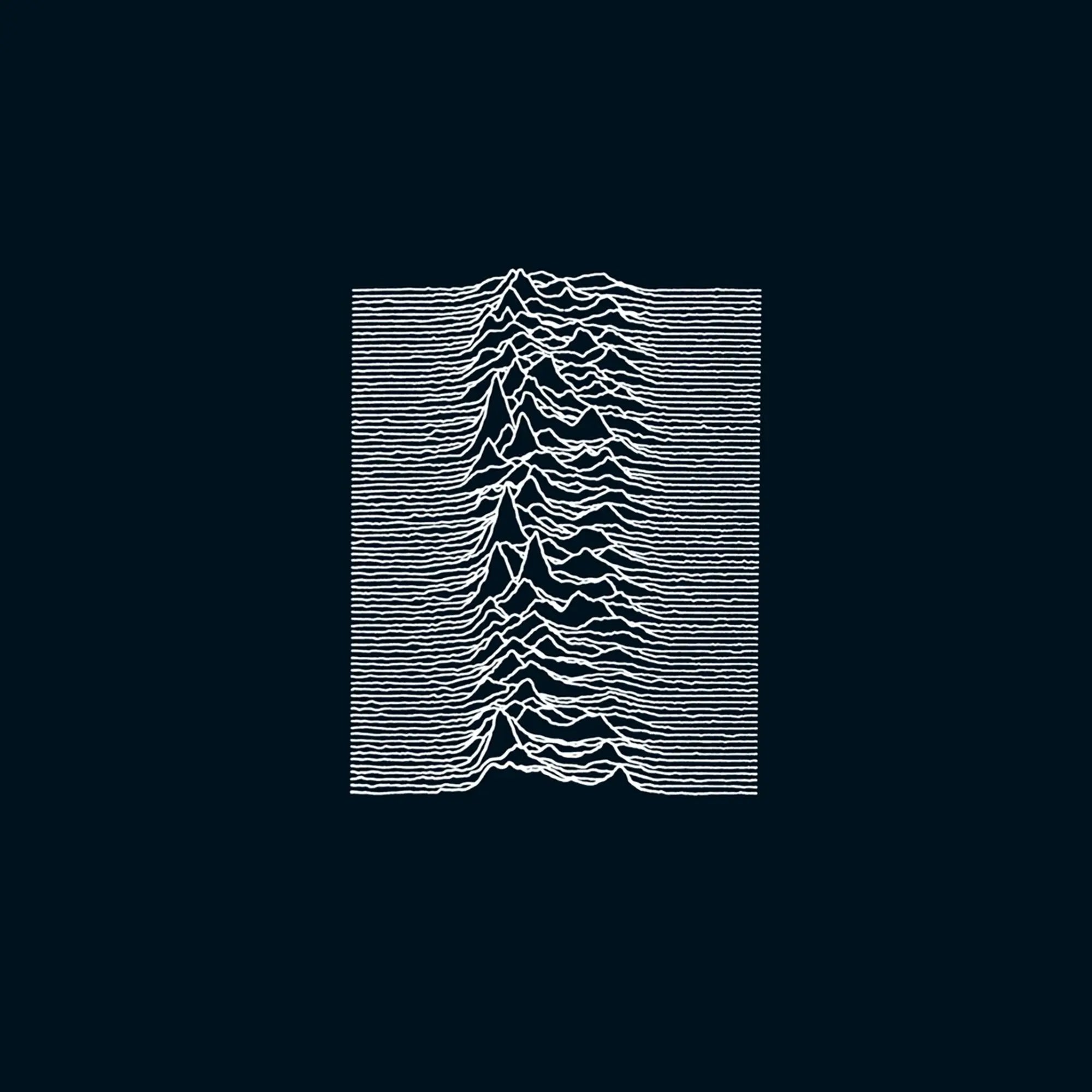
If you know one Saville sleeve, it's probably Joy Division's Unknown Pleasures, the white pulsar lines on black. As Factory Records' art director, he gave a Manchester post-punk label the look of a European design house. Factory treated design as equal to the music, everything got a catalogue number, even the club, even (famously) a lawsuit, and Saville was the reason the sleeves felt like artefacts rather than packaging.
His method, the thread that connects him to everything we care about here, was appropriation with intent: lifting an image from one context and letting it detonate in another. A record cover, he once said, is part of the everyday, the now. He'd take a reading from fashion or architecture, whatever felt pertinent, and fold it into the sleeve.
Why it still lands.
I'll put my designer's hat on for the close. What I love about this cover is the collision at its heart: a soft, romantic, hand-painted still life from 1890, and beside it a rigid, modular, machine-logic cipher pointing straight at the coming digital age. It's classicism and the floppy disk in the same frame. The rose and the code. Neither wins, and the tension between them is the whole design, a piece of graphic art that argues, without a single word of text, that the old and the new are always seducing each other.
For a shop that sells physical media carrying meaning across decades, that feels about right. The record survives. The painting survives. And forty years on, people are still turning the wheel to read what it says.
The reel is up on our Instagram now. Come find the roses.